Mar 27, 2014
Better looking plots with Matplotlib
Suppose there's some noisy data that needs fitting. After successfully fitting it, I want to show how the fit looks compared to the original. Matplotlib is awesome for this purpose, but it's default appearance settings are somewhat beaten with the ugly stick (but there are historical reasons for this). I'll try to make things look a bit better. This is all done in an IPython notebook and you can see the notebook itself here.
Setting things up
First thing is to start an inline Matplotlib session in IPython notebook. I also make the figure size a bit bigger than the default:
%pylab inline
rcParams['figure.figsize'] = (10,8)
As this post is about plotting and not fitting I'll cheat a bit and start out with the fit to which I add some noise:
points = 500
t = arange(0, points)
#exponentially decaying sine wave
fit = 4000 *sin(t/40.)**2*exp(-t/200.)
#randomly distributed noise
noise = 300 * random.randn(points)
raw = fit + noise
First attempt
To start out, let's plot the fit as a solid line and the raw data as points (using default Matplotlib settings):
plot(t, fit, label='Fit')
plot(t, raw,'o', label='Raw data')
#the lines below will repeat for each plot
#and I will only show them here once
legend()
ylabel('Raw fluorescence')
xlabel('Time')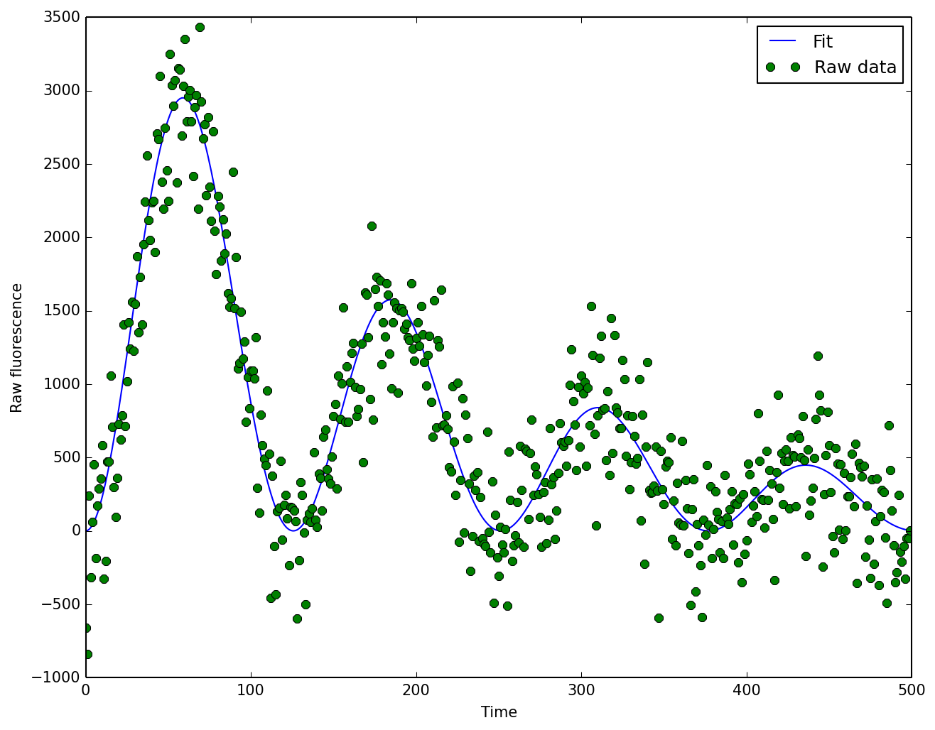
This is ok-ish for a quick and dirty check on things while exploring but not really something I'd want to put in a presentation or publication. How can things be improved?
Colors
First step would be to fix the plot colors. I use two great resources for finding good sets of colors for making plots. These are: ColorBrewer2 and Color Scheme Designer. The first is more geared towards plotting and the second is great for generating colorschemes for websites. I'll use ColorBrewer2 for the task at hand and pick two nicely matching colors for the plot. Also, I will change the alpha level for the points (alpha=0.75) and increase the width of the fit line (lw=3):
plot(t, raw, 'o', label='Raw data', color='#0EA16A', alpha=0.75)
plot(t, fit, '#EF5915', lw=3, label='Fit')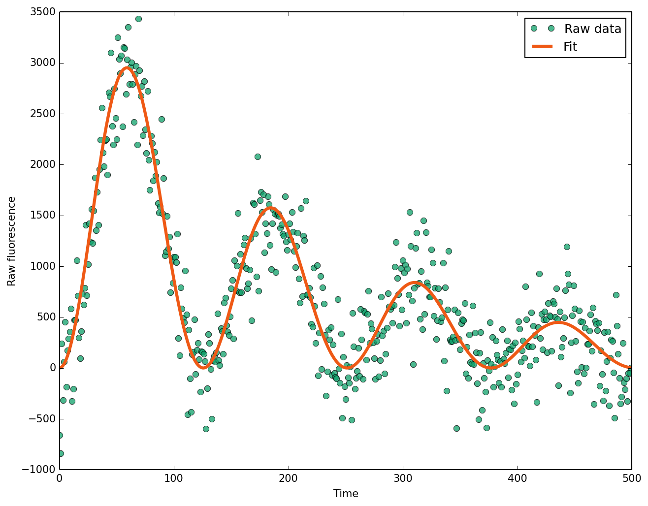 Better, but the raw signal points look too dramatic. This can be fixed by removing the border from the datapoints with
 mec='None' and making them smaller with ms=5:
plot(t, raw, 'o', label='Raw data', color='#0EA16A', mec='None', alpha=0.75,  ms=5)
plot(t, fit, '#EF5915', lw=3, label='Fit')
This doesn't hurt my eyes anymore :)
Not done yet!
I don't see a good reason for having a box around the plot. Axes on the bottom and left are ok but unnecessary on the right and at the top. Let's get rid of those!
For this I make a helper function to generate the figure and remove the lines and tickmarks (so I don't have to do this for each plot):
def myfig():
fig = plt.figure()
ax = fig.gca()
ax.spines['right'].set_visible(False)
ax.spines['top'].set_visible(False)
ax.xaxis.set_ticks_position('bottom')
ax.yaxis.set_ticks_position('left')
return fig, ax
fig, ax = myfig()
ax.plot(t, raw, 'o', label='Raw data', color='#0EA16A', mec='None', alpha=0.75, ms=5)
ax.plot(t,fit,'#EF5915',lw=3,label='Fit')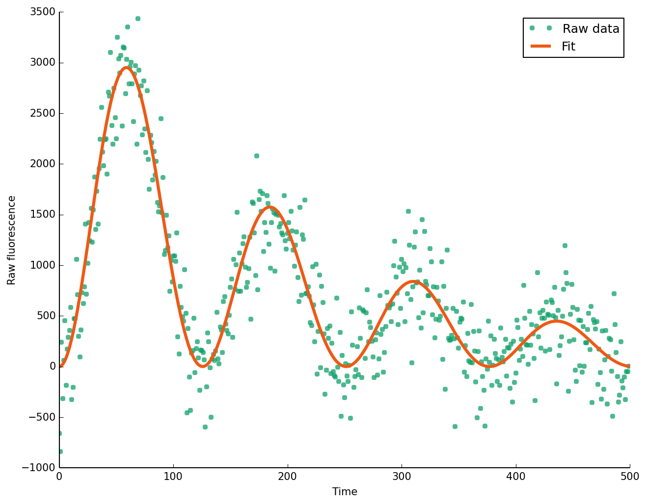 Looks less claustrophic.
Fixing the fonts
The default fonts look too small, and I prefer a fresher looking font to the default. Fira - the font for the Firefox OS looks good yet not too exotic, so I'll go with that. Feel free to use anything you like (but please not Comic Sans!). Additionally, I'll change the spacing between the tick labels and axes, increase the size of the ticks, use 3 symbols instead of 2 for the legend and remove the frame around the legend:
#font
rcParams['font.sans-serif']=['Fira Sans OT']
rcParams['font.size'] = 15
rcParams['legend.fontsize'] = 'medium'
#tick label spacing and tick width
rcParams['xtick.major.pad'] = 4
rcParams['ytick.major.pad'] = 5
rcParams['xtick.major.width'] = 1
rcParams['ytick.major.width'] = 1
#legend style
rcParams['legend.frameon'] = False
rcParams['legend.numpoints'] = 3

fig,ax = myfig()
ax.plot(t, raw, 'o', label='Raw data', color='#0EA16A', mec='None', alpha=0.75,  ms=5)
ax.plot(t,fit,'#EF5915',lw=3,label='Fit')
This I can already use to present stuff.
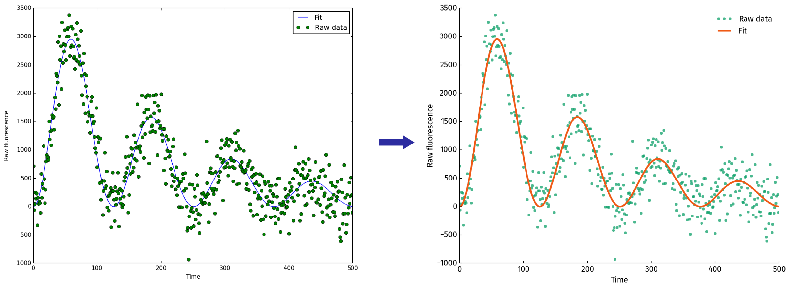
Result
After all of the above, things look quite a bit better:
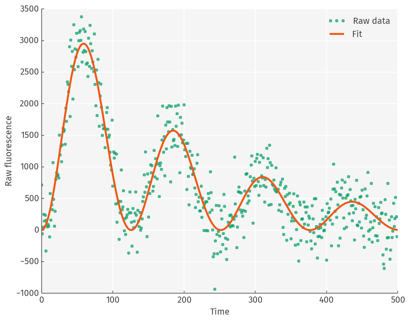
Bonus round
Any ggplot2 fans? Also, it looks somewhat better to use a dark shade of gray instead of black for text and axes.
gray = "444444"
rcParams['axes.facecolor'] = 'f5f5f5'
rcParams['axes.edgecolor'] = gray
rcParams['grid.linestyle'] = '-'
rcParams['grid.alpha'] = .8
rcParams['grid.color'] = 'white'
rcParams['grid.linewidth'] = 2
rcParams['axes.axisbelow'] = True
rcParams['axes.labelcolor'] = gray
rcParams['text.color'] = gray
rcParams['xtick.color'] = gray
rcParams['ytick.color'] = gray

fig,ax = myfig()
ax.plot(t, raw, 'o', label='Raw data', color='#0EA16A', mec='None', alpha=0.75,  ms=5)
ax.plot(t, fit,'#EF5915',lw=3,label='Fit')
grid()